 The Android OS offers a great user experience. Its operating system allows a lot of customization and an “open-door” approach to its usability. Not considering the divide between fans of Android and iOS, I think the problem with Android is not the core OS, but the fragmented user interface (UI) overlays that phone manufacturers place on top of Android’s own OS.
Even though there are multiple versions of the Android operating system available for the wide variety of devices that run it, the majority of them have some manufacturer-developed skin over the Android OS. That addition can do two things: add a layer of unnecessary functionality and complicate simple features.

Most common UI overlays that I’ve seen are from HTC’s Sense and Samsung’s TouchWiz phones. My personal experience is with HTC Sense with my Thunderbolt. While I enjoyed the first generation 4G LTE phone and my initial impression of Sense was a positive one, I eventually looked for solutions to remove the majority of the shortcuts and widgets from my screens.
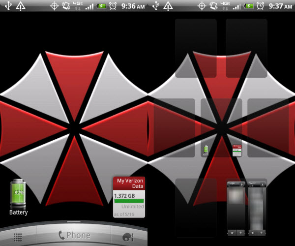
The overlay for HTC Sense in a new phone looks amazing, with its large time and weather widgets. Add easy access to your contacts, mail, and other utilities, and you’ve got some nice additions on the multiple screens. But after a couple months, all my screens were full of widgets or shortcuts, and swiping between them became a chore to remember where a specific launcher was.
My solution was Swipepad. The app adds hotspots on the perimeter of the screen, which open a launcher for apps, widgets, and shortcuts. I placed my most commonly used apps in one menu and my utility apps in the other and only opted to put a data usage monitor and a battery widget on the main screen. I’ve found that Swipepad reduces search times and makes the phone much easier to use.
Samsung TouchWiz also uses a similar system of customized widgets. The new TouchWiz UI, placed over Android 4.0 Ice Cream Sandwich for the Galaxy S III, looks like a mass of animations and functions that fill the screens. Multitasking looks like a strong feature in TouchWiz, but it appears extraneous for a common phone user. App widgets are great, but how much content is necessary all the time?

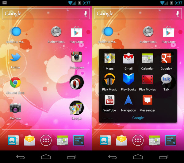
Stock Android 4.0 phones, like on the Galaxy Nexus, offer the best and worst of both worlds. The lack of a customized UI is great and lets you control the majority of the physical appearance of the screens, but widgets can still consume a lot of space. Ice Cream Sandwich allows you to create folders, but their appearance on the screen is kind of confusing and it’s easy to forget the apps that were inserted.
Android offers a great user experience with the customizations it makes possible, but Google hasn’t found the perfect interface yet. The fragmentation of interfaces from different manufacturers also has the tendency to add unnecessary features and bloatware that most users won’t want to deal with.
The distribution of the operating system may be just as fragmented, but having a core interface could increase the ease of usability for all Android users rather than having to constantly switch from phone to phone. Right now, users must choose a phone based on what kind of UI they’re willing to deal with. This is something that needs to be addressed in the future.

