 If your Google+ account looks a little different to you on your next visit, there’s a reason. Google+ got a facelift – for the better in many instances.
From a completely new on-screen layout to improved navigation, there’s a lot to love about the new Google+ look.
There’s also a lot to get used to. We’ll take you through the significant changes below.
A new profile page…that looks a lot like Facebook
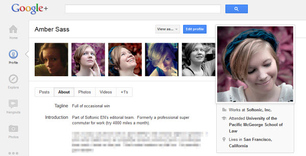
If you’ve seen Facebook’s Timeline interface, you might get a sense of déjà vu, looking at your new Google+ profile page for the first time. Just like with Facebook, your header images are the center of attention in Google+. Your profile photo shows up on the right side, while you have two template options to complement it: a cover photo similar to what you can choose on your Facebook Timeline or five smaller pictures lined up to the right of your profile photo.
Choosing the images is just as easy as it is on Facebook as well. Either pick photos from your Google+ albums or upload them directly from your computer.
As much as it resembles Facebook, the effect really is a nice one. With the right pictures, your Google+ profile will now really stand out.
The navigation ribbon
This is where the new Google+ interface truly shines. The static icons that used to grace the top of your Google+ account have been replaced with a dynamic navigation ribbon on the far left of your page.
Not only can you access your stream and profile with ease just like before, you can add new photos with a click of your mouse, find currently active Hangouts to join and even see what’s trending all over Google+ in one simple click.
Even better, if you don’t like the arrangement of the navigation button, all you have to do is click and drag them to where you want them for a truly customized experience. In Google’s official announcement, there were also hints that future feature apps would now have a nice home in the navigation ribbon. Something to look forward to, perhaps?
Improved image and video displays
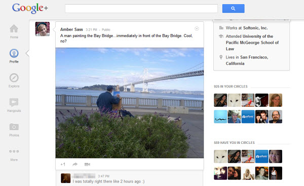
The new Google+ really lets your images and videos take center stage. On the new layout, you can view and share large format images, as well as high definition videos directly on your home stream. The visual effects can be stunning.
Increased prominence of video chat and related features
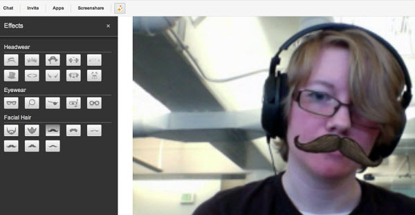
If you’ve never tried video chatting on Google+, now’s as good a time as ever. Just click on the “Hangouts” button in your navigation ribbon and give it a spin. There are continuously updated lists of already in-progress hangouts to join, as well as a fun Effects feature that lets you add a bit of silliness to your video conversations.
What’s with all the white space?
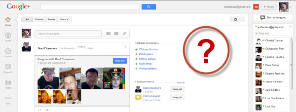
There’s an awful lot of empty white space on the right side of the new Google+ interface, between your home stream and the list of users available to chat. It’s had a lot of people speculating as to whether Google intends to start placing ads tailored to users’ interests like Facebook already does.
There’s no official word on the reasoning behind the empty space, but that hasn’t stopped good-natured Google+ users with some extra time on their hands from coming up with their own memes and ideas for what to do with the space. You can follow the fun or even contribute your own ideas on the #whitespace hashtag on Google+.
Do you like the new Google+ layout? Is it a great improvement or just a blatant, unimpressive copy of Facebook’s Timeline?
(via Softonic FR)

